Colors in Interior Design: How to Choose and Combine the Perfect Colors for Your Home
- Sep 22, 2024
- 14 min read
Updated: Jan 15
1. Introduction: Why Colors Are More Important Than You Think
You know those moments when you walk into a room and something just feels off, but you can’t quite put your finger on it? Well, colors might be the culprits.
Especially if the walls are painted in a “tired” beige or an overly enthusiastic orange, choosing the right colors is a long-term process and absolutely essential.

Colors aren’t just simple decorative shades; they can influence your mood, the way you perceive space, and even how comfortable you feel in a place. So, let’s see why they’re so important, why you need to consider them, and how they can transform your home (or maybe even your life, who knows?).
Colors Give You Energy (or Drain It)
Imagine walking into a neon green living room after a long day at work. Maybe your energy will suddenly spike, but not for long! Bold, intense colors can stimulate your senses, but too much stimulation will eventually make you feel exhausted.
On the other hand, a soft blue will calm you down and help recharge your batteries. So, when choosing colors, think about how you want them to influence you.
Colors Can Change the Perception of Space
Want to know a secret? Colors can make a small room feel bigger and a large one feel cozier. If you're in a tiny studio apartment, light and cool colors are your best friends. They reflect light and make the space feel more open.
On the other hand, if you have a huge living room that feels too “empty,” warm and dark colors will make it feel more intimate and welcoming. It’s like a magic trick for interior design!
Colors Can Influence… Your Appetite?
Believe it or not, colors can even influence your appetite! For example, yellow and orange are often used in restaurants because they stimulate hunger. On the other hand, blue, while calming, has the opposite effect, it reduces appetite.
So, if you’re trying to lose weight, maybe consider painting your kitchen in a soft blue and avoid bright red on the table (red is known to speed up your heart rate, and consequently, your appetite).
2. What is Color Psychology?
Imagine you’re at a party, and the wall colors start talking to you.
No, you haven’t had too much to drink.
We’re talking about color psychology, a fascinating field that studies how color combinations affect our emotions and behavior.

Colors aren’t just pretty decorations; they are real “manipulators” of our mood.
Choosing colors is crucial, as each color has its own personality, and when you choose a certain shade, without realizing it, you’re also choosing how you’ll feel in that space.
Red: The Stimulant That Raises Your Blood Pressure (and Passion)
Red is one of the most “shouty” colors, both literally and figuratively. It’s known for stimulating energy, increasing heart rate, and even raising blood pressure. That’s why it’s often used in gyms or restaurants, where you want people to be active and passionate.
But beware! Too much red in the house can lead to stress or irritability. So, if you don’t want your living room to feel like a boxing ring, you might want to limit the use of this color to accents.
Blue: Calm, Serenity, and Productivity
Blue is the “Zen” of colors. It’s associated with calmness, serenity, and mental clarity. That’s why you often see it in offices or bedrooms, places where mental peace and focus are essential.
However, blue can feel a bit cold if overused, so add a few warm elements to avoid making your office look like a waiting room in an ultra-modern hospital. If you want to stay calm and productive, blue is the perfect choice!
Yellow: Sunshine in Your Home (But Not Too Bright!)
Ah, yellow, the color of sunshine, optimism, and… lessons on how not to overstimulate yourself. Yellow is excellent for adding a touch of energy and joy to a space. It’s perfect for kitchens or living rooms where you want to radiate positivity and recharge your batteries.
However, too much bright yellow can become irritating, so avoid turning your entire house into a giant post-it. A small dose of yellow works wonders, but too much can be like an espresso at midnight.
3. How Colors Influence Your Mood
Every color you see around you is, in fact, a form of emotional “manipulation.”
Yes, even that pale gray on the walls of a waiting room is meant to make you feel… bored.

Colors have a subtle but real power to influence our moods and behavior. It’s like adjusting your Spotify playlist: some colors are the equivalent of relaxing music, while others are like a rock concert. Let’s see how this magic works.
The “Happy” Colors and How They Lift Your Spirits
There are certain colors that seem to say, “Hey, let’s smile today!” Yellow, orange, and light green are colors associated with happiness, optimism, and nature.
They stimulate a sense of well-being and lift your mood, making them perfect for rooms where you want to feel energized, like the kitchen or office. But be careful! Too much cheerfulness can be exhausting, so use these colors in moderation, as accents that add energy without overwhelming you.
The “Zen” Colors and How They Bring You Calm
On the other hand, if you’re the type who seeks peace and tranquility after a long day, the “Zen” colors are for you. Blue, dark green, and lavender shades are perfect for bedrooms or bathrooms, places where you want to disconnect from the chaos of everyday life.
These colors induce relaxation and can even help you sleep better. It’s like adding a few drops of essential oil directly onto your walls. However, be mindful not to turn everything into a monastery – too much calm can become monotonous.
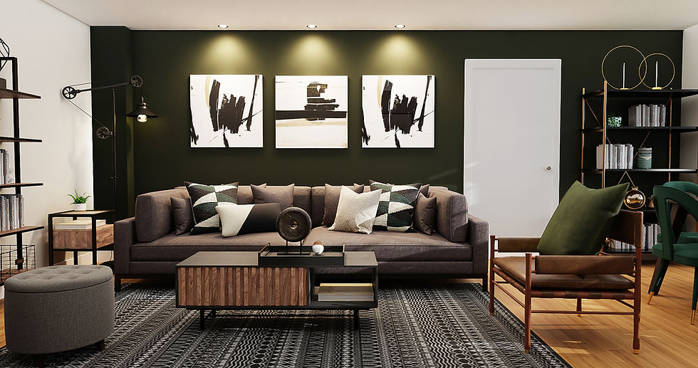
Example: Living Room Color Schemes
When it comes to choosing living room color schemes, it’s easy to feel overwhelmed by all the options. With so many popular living room colors to choose from, how do you pick the right color palette without turning your space into a circus?
Relax, this isn’t rocket science (though some interior designers might make it seem that way). With a little help from the trusty color wheel, you can create an inviting space that reflects your personal style.
Start by picking an accent color that pops. This could be something bold like ocean blue or a soft, off white for a more subtle effect. Bright colors are great for adding energy, while cool colors like blues and greens can help create a calming, serene environment. Think of it as choosing the perfect color to set the mood, whether you want a lively vibe or a more zen feel.
To keep things balanced, many interior designers recommend sticking with two colors and using complementary colors to create harmony.
This might mean pairing a soft shade of gray with an accent of mustard yellow, or an off white wall that acts as a blank canvas for your more daring decor choices. It’s all about mixing in a bit of modern sensibility with your personal touch.
Remember, even the simplest color scheme can transform your living room from dull to dynamic. The key is to find that sweet spot between creating a stylish look and still feeling comfortable enough to kick back and relax. After all, your living room should be your sanctuary, not a showroom!
4. Combining Colors: The Art and Science in Balance
Combining colors may seem like a complicated task, but in reality, it’s more of an enjoyable journey between science and art. Think of the color wheel as your GPS for interior design.
By following a few simple rules and using a bit of intuition, you can create combinations that transform a dull room into a masterpiece.

However, just like on any journey, if you take too many risky turns, you might end up with a living room that looks like a circus clown. So, let’s explore how to combine colors with elegance, avoiding any color accidents.
Complementary Colors: The Contrast That Draws Attention
Complementary colors are those that sit opposite each other on the color wheel, like two rivals on a chessboard. Classic examples include red and green, blue and orange, yellow and violet. These combinations create strong contrasts, often used to make an element stand out.
Imagine a green couch against an intense red wall, it’s like saying, “Look at me, don’t focus on anything else!” However, too much contrast can be tiring for the eyes, so use these combinations sparingly. Think of them like salt in a dish, a little is perfect, but too much can ruin everything.
Analogous Colors: Harmony and Balance
Analogous colors are those that sit next to each other on the color wheel, like yellow, orange, and red. These combinations create a pleasant harmony, without too many visual “clashes.”
They’re ideal for calm, fluid interior designs where all the elements seem to blend naturally.
If you want a room that inspires relaxation, you can opt for an analogous color palette, such as blue, green, and turquoise. Think of them as a well-coordinated team, they work perfectly together, without fighting for attention.
5. Warm Colors vs. Cool Colors: How to Choose What Works for You
If colors were people, warm colors would be those cheerful and energetic friends who want to dance at parties, while cool colors would be the zen friends who suggest doing yoga.

In interior design, choosing between warm and cool colors isn’t just a matter of taste; it’s also about how you want to feel in that space.
Do you want energy and dynamism?
Or do you prefer calm and relaxation?
Let’s see how each category works.
Warm Colors: Energy and Intimacy in Your Home
Warm colors include tones like red, orange, yellow, and all their softer or more intense variations. These shades are perfect for creating a vibrant and friendly atmosphere. They’re ideal for spaces like living rooms (living room paint colors should be on a more softer side) or kitchens, where you want people to socialize, laugh, and feel connected.
However, don’t overdo it.
Too many warm colors can turn your home into a permanent festival, which is great for a weekend but exhausting to live in 24/7. Try combining them with white and other neutral shades. Think of them like strong coffee: a little energy is great, but too much and you start to shake!
Cool Colors: Perfect for the Bedroom
On the other hand, cool colors like blue, green, and violet are associated with calmness and relaxation. These shades are excellent for decorating bedrooms, bathrooms, or offices where peace and focus are needed.
In addition, cool colors can make a small space feel larger because they have the ability to visually “push” the walls back. However, a space filled only with cool colors can become a bit too distant or even emotionally cold, like having a conversation on a rainy day. So, if you opt for a cool palette, add some warm accents to keep the atmosphere balanced.
6. Neutral but Powerful: How to Use Neutral Shades Without Being Boring
Ah, neutral shades. Many people see them as the “bread and water” of interior design, necessary, but not too exciting. However, you should know that when used correctly, neutral shades are more like a solid pizza base: they may not do all the heavy lifting, but they provide stability and allow the other ingredients to shine.

So, don’t underestimate them.
They can transform a bland room into an elegant and sophisticated space.
Let’s see how to use them smartly without falling into the “too simple, too boring” trap.
Play with Textures and Materials
When you use neutral shades like gray, beige, or white, the key to success lies in the textures and materials you choose. A simple white wall might seem dull, but add a soft rug, a knitted throw, and some velvet pillows, and suddenly the space becomes an oasis of comfort and style.
You can pair a gray sofa with a natural wood table and metallic accents, and suddenly “neutral” becomes “cool” and “sophisticated.” Think of textures as the spices in your kitchen: a little pepper can change everything.
Accent with Subtle Contrasts
Neutral shades don’t have to be monochromatic. You can add subtle contrasts by using different tones from the same palette. For example, gray walls combined with a dark gray sofa can create an elegant, modern visual effect without straining the eyes.
Also, add black or white elements to better define the space. Neutral shades allow you to play with contrasts in a subtle way, without overwhelming the room with too many colors. It’s like enjoying a fine dessert: you don’t want it to be too sweet, just enough to savor it fully.
7. Color Accents: The Power of Details
When we talk about color accents, we refer to those little “bursts of personality” you add to a neutral or monochromatic space. Think of them as the jewelry of an outfit: you don’t dress head to toe in diamonds, but a well-placed necklace can make all the difference.

In interior design, color accents bring life and dynamism without turning the room into a “too colorful” mess. But let’s see how to use them correctly, without turning your living room into… a carnival.
Small Accents, Big Impact
When it comes to color accents, less is more. A neutral wall can come to life with a few pillows in a vibrant shade like turquoise or mustard yellow. Or, if you have a gray sofa, add a bright orange throw.
You don’t even need to overhaul the entire room, a rug, a vase, or even a few colored frames can completely change the energy of a space. The trick is to use these details sparingly and let the elements “speak” on their own without competing with each other. Think of them like a good seasoning: a little goes a long way in transforming the entire flavor of the room.
Seasonal Accents: Change the Look Without Effort
Another advantage of color accents is that they’re temporary and easy to switch up. Bored with those pink pillows from spring? No problem. Swap them out for some burgundy ones for fall, and voilà, your room has a fresh new look without breaking the bank.
Seasonal accents are a smart way to keep your design fresh and updated.
Plus, they give you an excuse to shop more often, “I need something new for the fall season, right?” 😉
8. How to Use Colors to Expand or Shrink a Space
Colors are like the illusionists of interior design.
Without moving a wall or doing a major renovation, you can completely change how you perceive the size of a room.
Do you want your small bedroom to feel bigger?
Or perhaps you want your enormous living room to feel cozier?
With a few color tricks, you can create spaces that make you feel comfortable, no matter the room’s actual size. Let’s see how this magic works.
Light Colors Make a Room “Breathe”
Light colors like white, beige, pastels, or pale shades of blue and green reflect light and create the illusion of more space. If you feel claustrophobic in your 30-square-meter studio, try using a light color palette for the walls, ceiling, and floors.
The room will suddenly feel more airy and spacious. It’s like opening a mental window, even if you don’t have an actual one. Add some mirrors here and there, and you might wonder if you’ve stepped into a palace… well, at least a mental one!
Dark Colors Add Intimacy and Warmth
If you’re on the opposite end of the spectrum, say you have a huge living room that feels too cold and empty, dark colors are the ideal solution. Shades of brown, dark green, navy blue, or even charcoal gray create a cozy atmosphere and make the room feel smaller, meaning more comfortable (avoid black and white contrasts).
It’s like dressing the walls in sweaters.
This is an excellent solution if you want to turn a large room into a more intimate and welcoming space without sacrificing style. So, if it feels like you’re living in a warehouse, a little “darkening” of the colors will completely change the vibe.
9. The Most Common Mistakes in Combining Colors (and How to Avoid Them)
When it comes to colors, there’s a fine line between an inspired design and a color catastrophe. We’ve all seen rooms that seem to scream “Help!” because of some unfortunate color choices.
The good news is that most mistakes in color combinations are easy to avoid if you know what to look for. Let’s review the most common mistakes and how to avoid them with grace.

Using Too Many Bold Colors
Ever feel like a room is trying to “blind” you with its energy? That happens when too many vibrant colors are combined without a strategy. If every wall is a bright color and every piece of furniture competes for attention, you might feel like you’re in an amusement park, not a home (choose your kitchen or living room paint color wisely).
The solution?
Choose one or two strong colors for accents and let the rest of the room be calmer, with neutral or softer tones. Think of bold colors like party guests: it’s great to have a few that draw attention, but if everyone’s shouting, you’ll go home with a headache.
Not Using Contrasts Correctly
Contrasts are essential for creating an interesting design, but they need to be balanced. A common mistake is either using too much contrast (which becomes exhausting for the eyes) or not enough (which makes the space look flat and monotonous).
The key is to combine complementary colors or introduce some contrast between light and dark shades. For example, a white wall can be perfectly complemented by dark furniture, but if you have light gray walls and dark gray furniture, the room will look elegant without becoming tiring. Contrasts are like the balance between salt and sugar, you need both to get the perfect taste.
Ignoring Natural Light
Light is a color’s best friend, and yet it’s one of the most ignored variables.
A room can look completely different depending on how much natural light it gets. Colors that look great in a showroom or on Pinterest can appear totally different in your room.
If you have a room with plenty of natural light, you can experiment with darker or more vibrant colors since the light will compensate.
In contrast, a dimly lit room will benefit from lighter, warmer colors that reflect more light. Ignoring this rule might leave you with a dark, depressing room when you were actually aiming for a relaxing oasis.
Lack of a Color “Focal Point”
Sometimes the problem isn’t that you’ve used too many colors or too few, but that there’s no central focus in the design. Without a main color element that draws attention, the room can feel incoherent.
This focal point could be an accent wall, a bold piece of furniture, or even a large, colorful painting.
The idea is to give the eyes something to “rest” on. Without this central point, the colors tend to get lost, making the entire space feel chaotic or, conversely, boring. Think of the focal point as the main character in a movie, without it, the story doesn’t make sense.
10. Conclusion: Colors in Interior Design
At the end of the day, the colors you choose should reflect you.
Whether you prefer neutral tones, vibrant accents, or a bold mix of contrasting hues, your home should inspire well-being and make you feel good. Don’t be afraid to experiment, those carefully chosen colors can transform your space into a true personal refuge.
Looking to transform your space?
We offer professional furniture and interior design services to help you bring your vision to life. Whether you need a skilled interior designer to guide you through a full makeover or just a bit of expert advice on the perfect layout, we’re here to support you every step of the way.
On top of that, we offer free interior design courses and 1:1 mentorship sessions tailored to your personal challenges, so you can grow, learn, and design with confidence at your own pace.
We wish you a great day and wonderful experiences in all your interior design endeavors. ✨


Comments